Digitized Inspections
$20M in value—and that's annually. Tested and proven in <5 weeks.
First, you 'll need some context behind inspections at CarMax:
CarMax sold 1,311,903 vehicles by the end of FY 2024, totaling 26.5 Billion dollars in total net sales and operating revenues.
in order to sell all of these cars, CarMax needs to buy them too.
They buy ~300,000 vehicles per quarter. That's roughly 3,300 cars per day.
and each car that's purchased needs to be inspected and reconditioned before being sold again.
Mechanics perform a 125+ point inspection process on each vehicle
(excluding initial purchase and exterior cosmetic inspections)
After their first mechanical inspection, vehicles experience a 45% rework rate.
Vehicle defects are either caught later in the inspection process, or even worse, by a customer.
this costs ~6 days at $5.5 per day per vehicle whenever they need additional repairs.
That may not seem like a big cost. But at scale, thats ~$11.8M per year, and even more in lost customers.
*Opportunity cost calculated by assuming 800K retail cars sold in a year
CarMax was losing ~$11.8 million a year from vehicle inspections. The Service Operations product team wanted to improve this process. We were given less than 5 weeks to find a better way.
As the sole intern product designer, I worked alongside the product manager intern to prototype a new inspection system under a lean, product-led approach.
That means I led all aspects of design for this first prototype, and every UI deliverable and design artifact you see here was produced by me.
Despite not having any UX researchers, collecting accurate data was a non-negotiable, so I ensured rigorous, iterative testing was a core part of our strategy.
Achieving our high-impact goal in this timeframe meant high-frequency, intensive collaboration with process engineers, developers, users, and other designers.
Role
Lead Product Designer (Intern)
Design
Figma prototyping with variables and conditional logic
Horizon (CarMax design system)
Content design (Information architecture, UX writing, + more)
Research
UserTesting/UserZoom
Moderated Usability Testing
Alignment
Figma Slides for presentations to leadership and other teams
Solution
I designed and tested a proof-of-concept centered around the mechanical interior part of the inspection process. This portion is the longest part of the process. Narrowing down the scope to Mechanical inspection proved the solution for the most complex scenarios, laying the groundwork for other inspection phases.
I built a digitized inspection prototype to concept test with MAs (Mechanic Associates) that scored a 100% avg. satisfaction score and buy-in from key stakeholders.
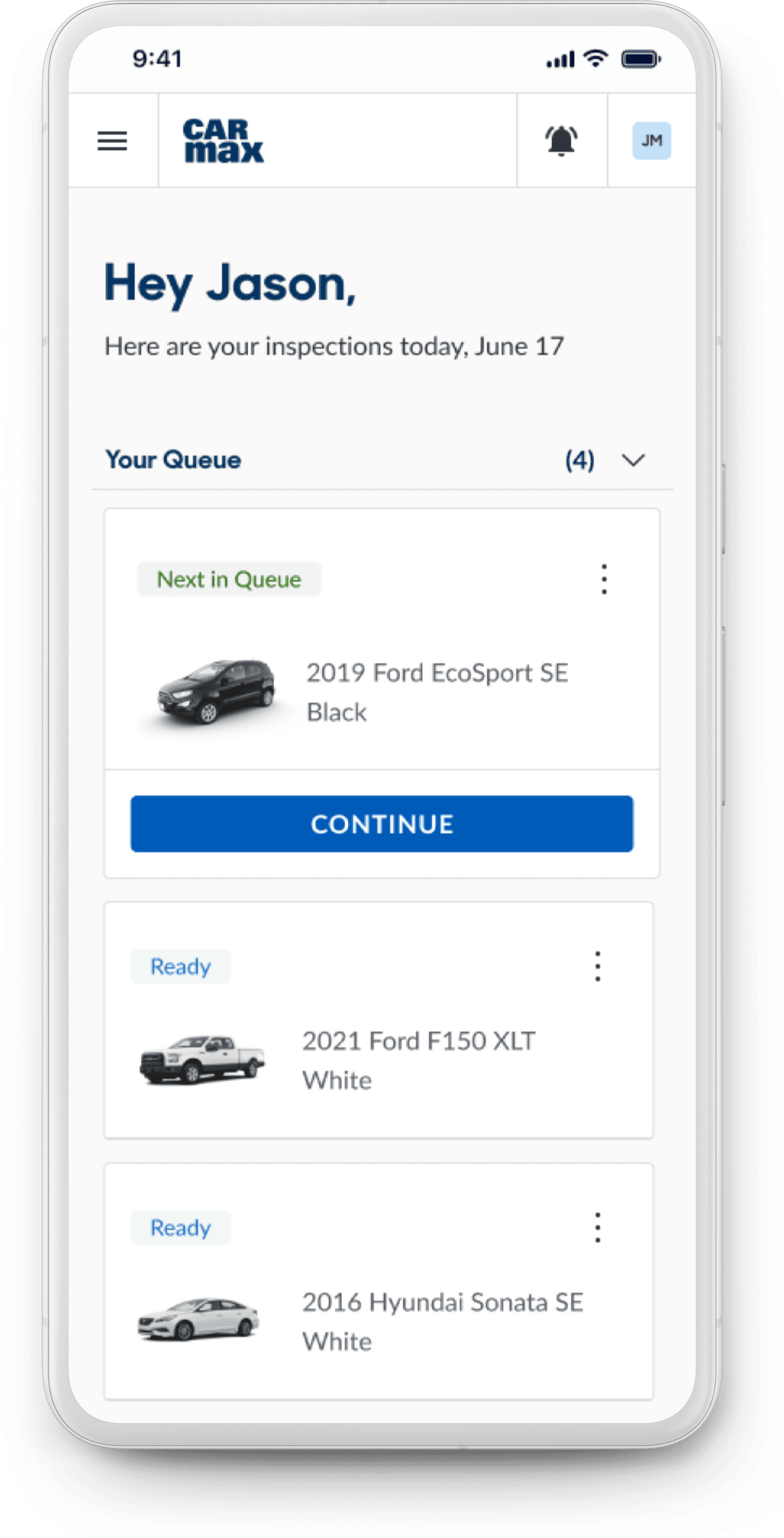
First, MAs get an overview of their daily inspection tasks.
As our MA, 'Jason', signs in to his unique account, he sees his own inspection queue for the day. Everything he needs now lives in the app.
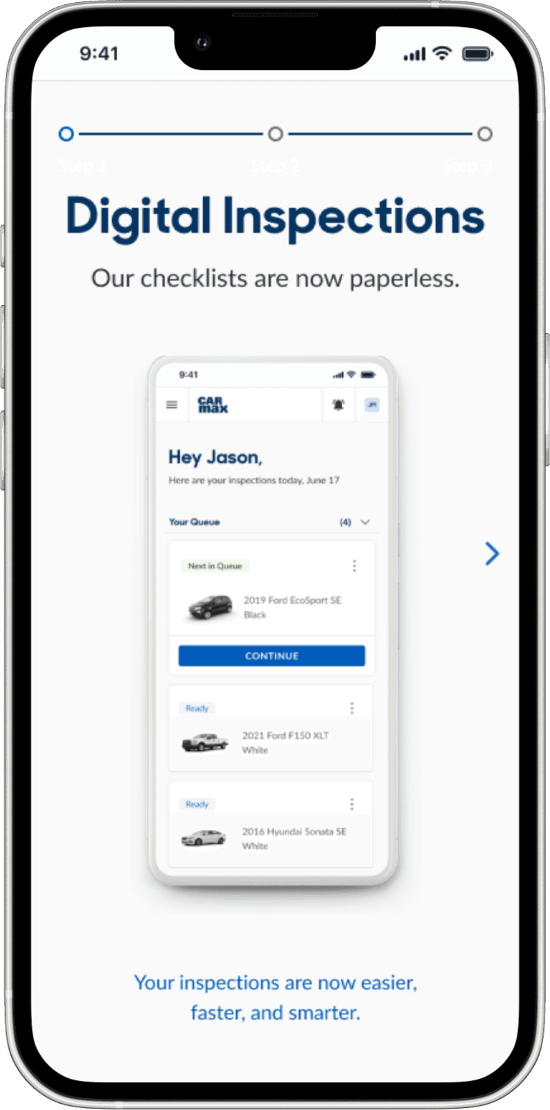
Transitioning from paper to digital
To aid in the transition. I added a 3-step tutorial guide to let mechanics quickly gain familiarity with how digital checklists will replace paper. This ensured usability, as we observed that MAs were able to complete their jobs entirely without pen-and-paper or any instructions from us, and neither did they face any issues.
Form factor and device type
Although the actual mobile device choice will depend on many factors (durability, cost, etc.), I did consider the product's general form factor. Mobile was the most familiar and practical for our MAs' tasks.
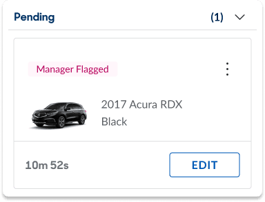
Pending Vehicles Queue
When vehicles show signs of failing CarMax standards, they need to be 'kicked' from inspections. While MAs wait for manager approval, they can update the vehicle's status appropriately while they continue to the next car.
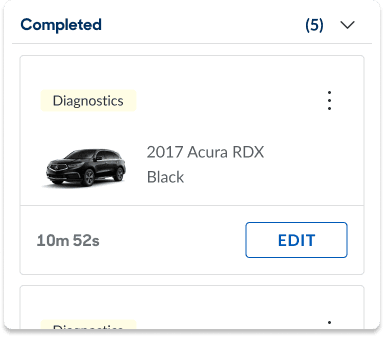
Completed Vehicles Queue
Completed mechanical inspections show their elapsed time so that MAs can manage their pace accordingly. The vehicle status updates to Diagnostics, who prescribe repairs based on issues that MAs report.
Next, MAs check off issues they find in a car.
The worst enabler for shortcuts was the singular comment box at the end of the paper checklist which everyone would skip to instead of having to scan the checklist for what they're actually supposed to mark.
Now, whenever Jason finds something wrong, the comment box is item-specific so that the issue can be documented accurately. This enables data visibility into vehicles' most common issues for our process engineers to parse through.
MAs mark issues in the way that works best for them.
Most MAs performing mechanical inspections are entry-level (MA2-MA3), so theoretically, they could have no functional expertise.
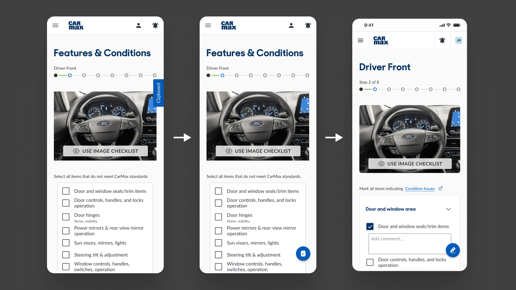
In this scenario, Jason struggles to find a specific item in this longer 'Driver Front' section, so he uses the image checklist for a more visual search.
Then, the issues get added to a summary list, kind of like a shopping cart.
Not only do MAs add comments at different times (either as soon as they find something, or at the end), but if Jason realizes he missed a minor issue, or finds something small at the end, we want to encourage being able to make that small edit at any point, even if he's in a rush to get all of his cars done.
Finally, MAs confirm their summary for each section.
Jason has previously never checked yes or no for each individual item. For legal and quality assurance reasons, our process engineers were uneasy with encouraging this behavior with an "only check what's wrong" checklist.
So I implemented confirmation checkpoints for each section, which signaled accountability, while still giving MAs the ability to do their jobs quickly. This was approved by our process engineers.
This action also confirms when an MA is 'done' with a section.
Impact
Measuring success
We established goals of making our product desirable, usable, and viable.
We wanted to modernize pen-and-paper checklists, and prove that it would be mutually beneficial by being an acceptable replacement.
UX Metrics
100%
ESAT (Employee Satisfaction Score)
On a scale of 1-5, every participant rated our digital checklist a 5: I’m very satisfied and would definitely use this over pen and paper
~20%
Decrease in avg. cycle time
MAs completed 3 cycles, each measuring at or below standard cycle time (<12 min.), mostly due to not having to write anything. This decrease would be amplified in larger reconditioning centers where MAs need to spend a few minutes to walk their inspection sheets to their Diagnostics team.
This also doesn't consider minimized errors associated with manual data entry, accelerated decision-making processes, ultimately boosting productivity and operational efficiency.
N/A%
Increase in process adherence (General observation, not measured)
By having each vehicle region separated by different pages, MAs were forced to follow the Process Engineering recommended sequence.
Throughout every cycle, we observed MAs actively referencing the checklist during their checks, holding the phone when possible instead of placing it off to the side as they usually would with paper checklists.
0%
Error rate
MAs were able to complete their inspections with our product as a complete substitute without any issues.
Buy-In secured
Approved by key stakeholders
Our prototype was reviewed and approved by process engineers and Legal (by proxy), senior mechanics, and various SMEs.
Forecasted KPIs
~20%
Inventory throughput
Assuming our improved cycle times are maintained.
$16,000,000
Annual profit increase from sales
Assuming a 5% incremental sales lift, directly attributable to faster inspection cycle times and the resulting availability of additional inventory.
$1.3m - $6.6m
Annual cost savings from decreased reworks
Although it's difficult to quantify process adherence, as long as it improves, reducing the rework rate from the current 45% to a range of 40% to 20% would yield cost savings in this range.
How might we…
Before jumping to a solution, the first question I asked was if the solution would even still be a 'checklist'. I kept our goal broad with the outcomes in mind, and without suggesting a solution.
How might we enable MAs (Mechanical Associates) to achieve higher efficiency and accuracy, to reduce rework rates in the reconditioning process?
And if all we did was simply make a mobile version of these checklists…
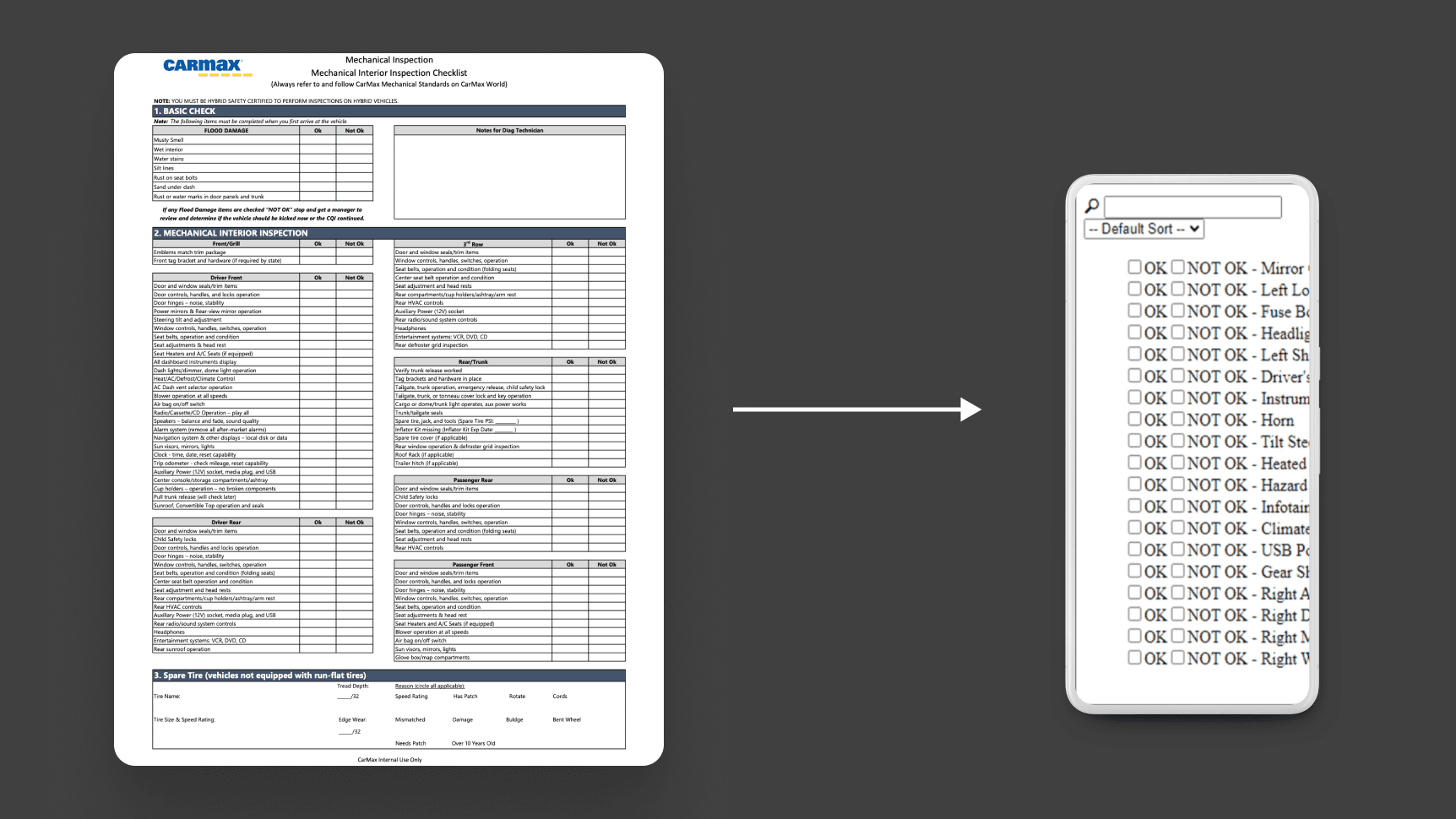
We'd still have the same problems.
Problem
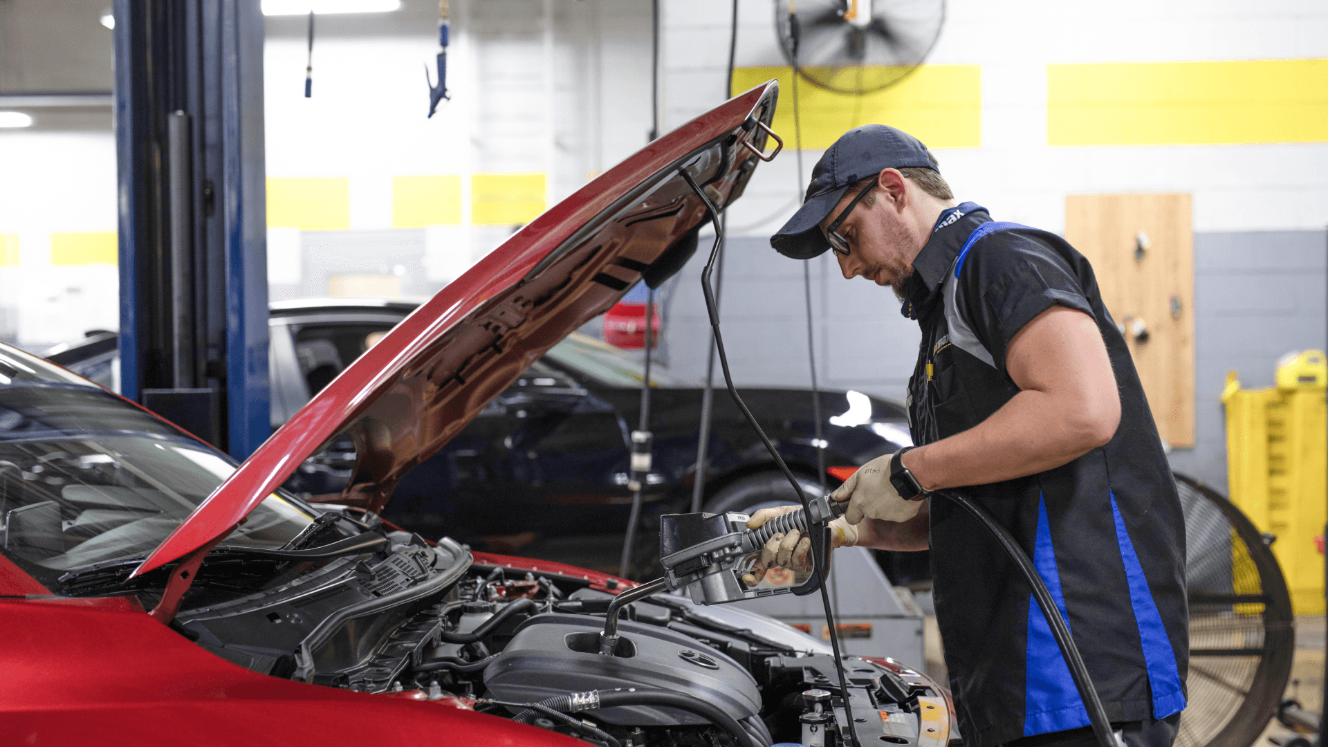
CarMax mechanics have been using paper checklists during their inspections. As they each complete 35-45 inspections per day, they should certify every inspection point, but don't always. Paper checklists communicate defects to another team, who prescribes repairs for each defect.
CarMax's current inspection process relies on paper checklists that lead to missed issues and costly errors, resulting in a 45% vehicle rework rate.
Major Issues
MAs (Mechanical Associates) are focused on the wrong things
MAs are motivated by optics of cycle time and big errors.
“If the guy next to you already has 2 or 3 kicks this morning, you worry about 'Have I missed something?'"
“It’s easy to miss the little stuff, but FQC will find them”
Easy to make mistakes
Taxing on memory, skimmable list, & relies on self-motivation
”You’re supposed to write as you go, but some people just remember everything”
I need to move quickly, so I don't want to look through this entire checklist just to find one thing."
Things are lost in translation
Diagnostic can’t decipher handwriting and specific notes
“Sometimes they forget to write ‘right’ or ‘left’ seatbelt, and that person has already left for the day”
The status quo
MA’s have long-established a preferred way of doing things.
“Pen and paper is just what I know.”
“Tech couldn’t really help here.”
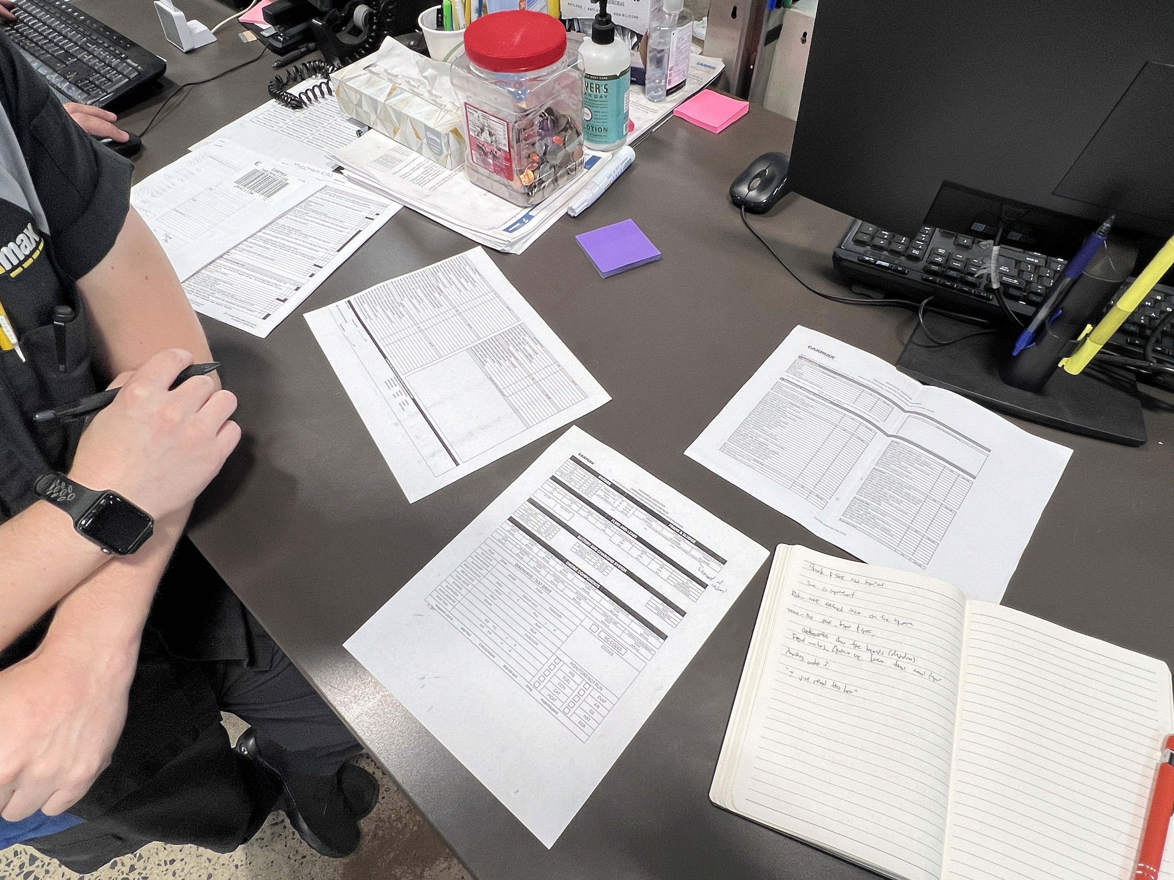
These paper checklists generally suffered from low process-adherence across all stores.
The comment box
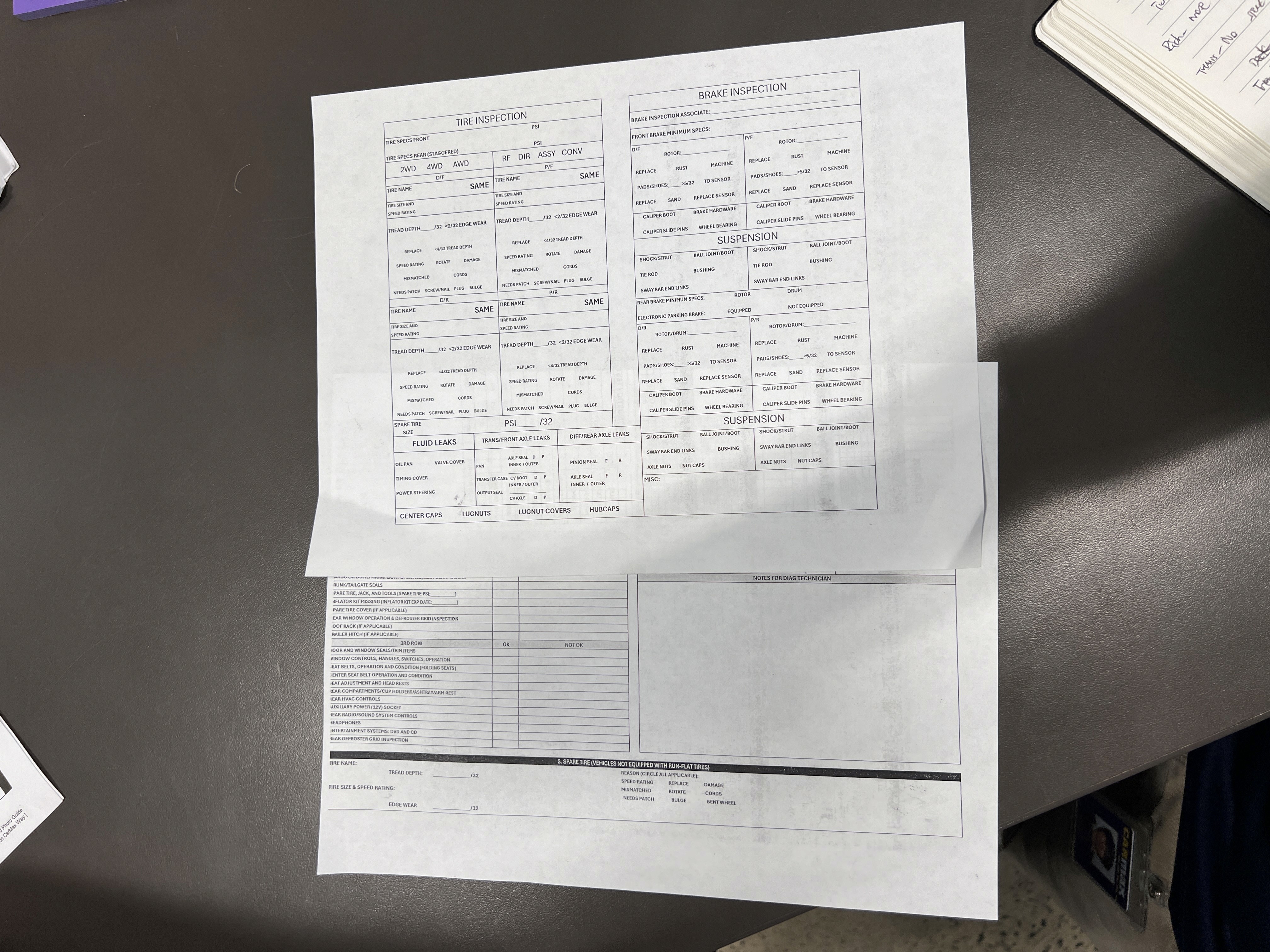
To summarize how these checklists are used, the most common practice we observed with our mechanical associates was performing inspections by their usual routines, and then only using the comment box to log issues. This was their most time-efficient and convenient way to record issues but also for the next team in Diagnostics to understand what's wrong with a vehicle.
Discovery
Over the course of 4 weeks, discovery was a constant in order to continuously gain as much information as we needed to push our solution as far as possible.
Our discovery process spanned the entire duration of the project.
Preliminary Research
To gain a high-level understanding of the vehicle reconditioning process. I started by collecting existing artifacts for context.
My first step in understanding the problem was looking at the entire process.
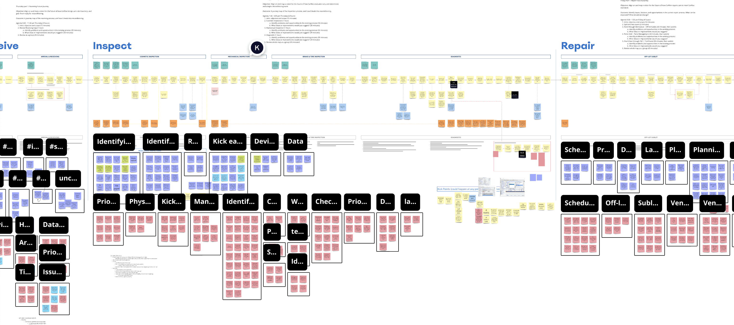
The ServiceOps team had already created extensive journey maps from high to low detail, which I used to familiarize myself with the problem space. As indicated, Mechanical Inspection is just one very small, but important part of the reconditioning process.
Site Visits
Ethnography and Interviews
Moving down from high-level, it was time to get a more detailed view on how inspections are currently done, and understand how daily inspections affect the many stakeholders involved in the entire process.
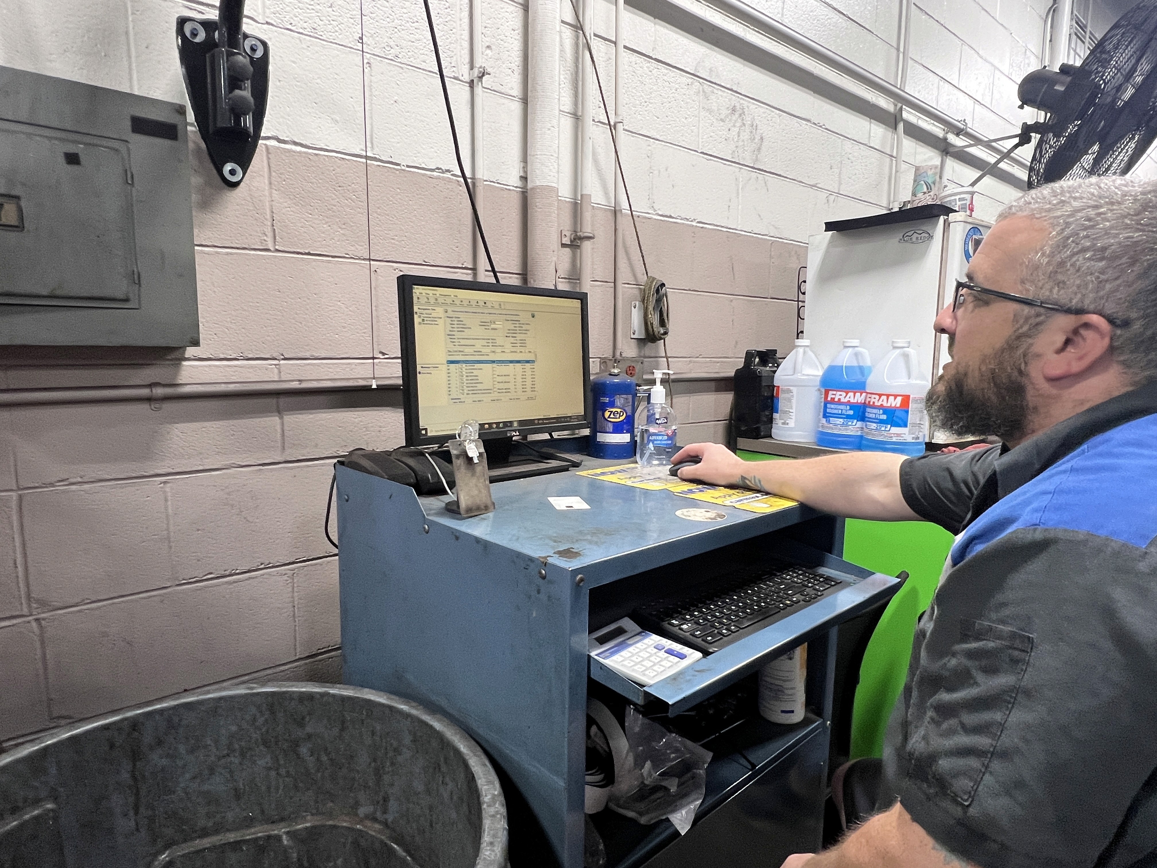
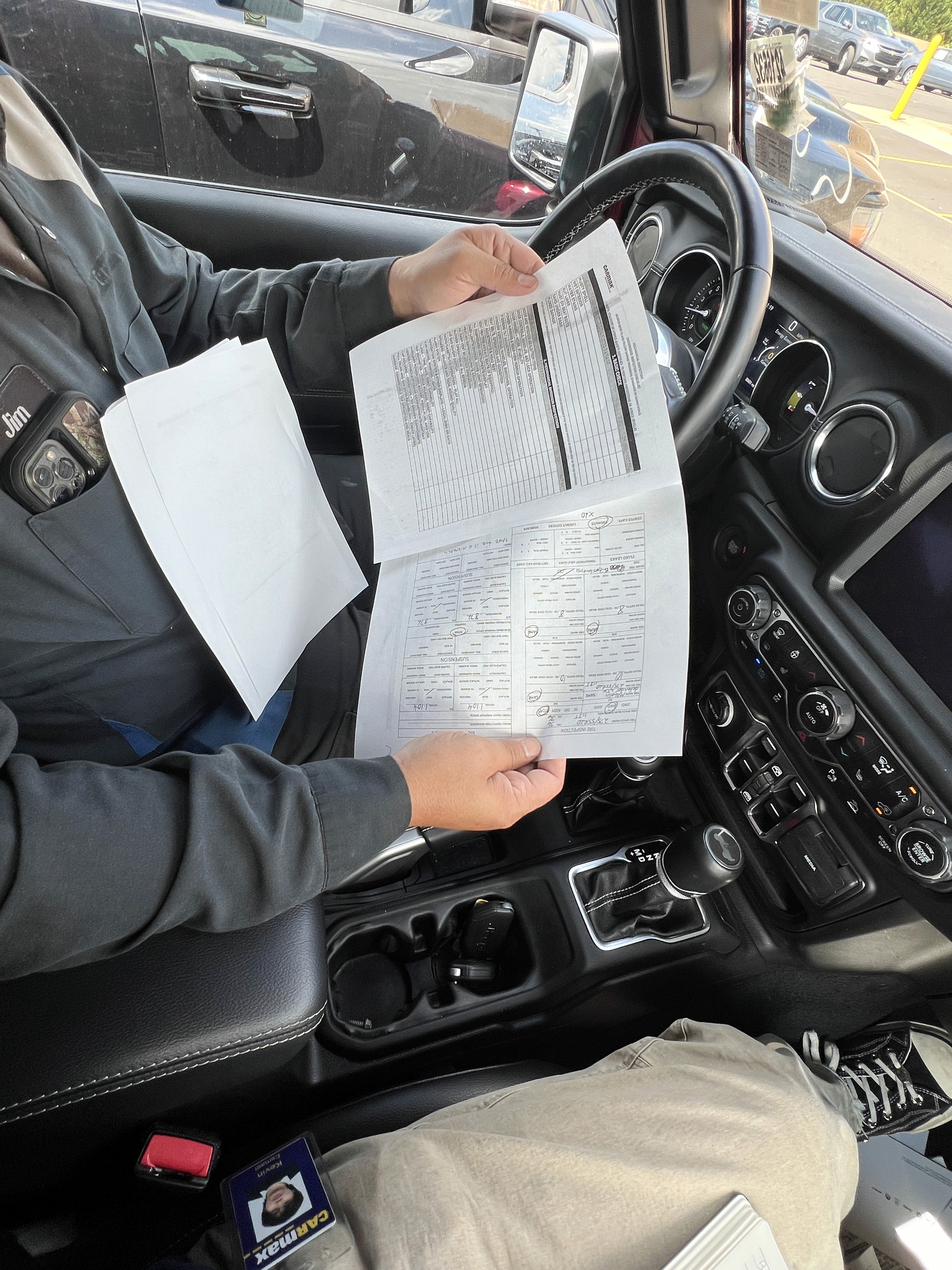
Next, we visited various CarMax stores in-person to observe and record the current mechanical inspection process and pain points.
Metrics we planned to record
Employee Satisfaction (ESAT)
On a scale of 1-5:
How satisfied are you with the use of checklists in the current mechanical inspection process?
Quality of inspection (Thoroughness of checklist)
Number of shortcuts observed
Compliance Rate
Number of deviations from the checklist
or
How often mechanic adheres to correct procedures

Key learning
I started this next phase of discovery with ethnography and interviews. Contrary to our preliminary research, I realized that we made a lot of assumptions — that mechanics use the checklist as they're intended, when in reality, they just use the comment box.
I asked a mechanic to show me how they'd ideally format the checklist. They covered most of it with a different sheet, only leaving the comment box.

Data analysis
To make sense out of our site visits, I affinitized our data points into 12 categories. These insights helped us identify the main underlying problems.

Stakeholder Mapping
With the many stakeholders involved in this space, we had trouble figuring out who exactly to prioritize for our next steps. I mapped our different stakeholders and prioritized them based on their levels of interest and influence.

Design
As the sole designer for this project, I was responsible for all produced screens. I worked closely with the product manager intern to develop research and testing plans that would extract the learnings I needed in order to design.
This product was created through extensive testing which we divided into 3 phases, each with multiple design iterations, and new stages of research and discovery.
Design Objectives
I started defining objectives by prioritizing different characteristics and features, as well as the requirements and constraints of the potential solution.
Design Requirements
A Checklist
Needs to be some sort of checklist, or achieve the same function
Records data
It must document what issues are occurring
Improved Information Design/Content Design
Must have some sort of intuitive information clustering/categorization/customization that makes the checklist usable
Manual entry
Must allow some amount of manual entry in order for MA's to use it, and to reduce MA pushback
Design Constraints
<12 min.
At the minimum, it should match the amount of time it takes to complete an inspection, and not add any time.
Portable device
Must be a handheld device that MAs can conveniently reference during inspections.
Works with "low" internet
Can't require a high-bandwidth, as it must be fast. We also need to consider that some mechanic floors are larger than others; some span multiple buildings.
Prioritizes what MAs are worried about
Must prioritize metrics MAs are worried about: kicks, manager's time expectations, and the extra work created for mechanics in Diag.
Design Prioritization
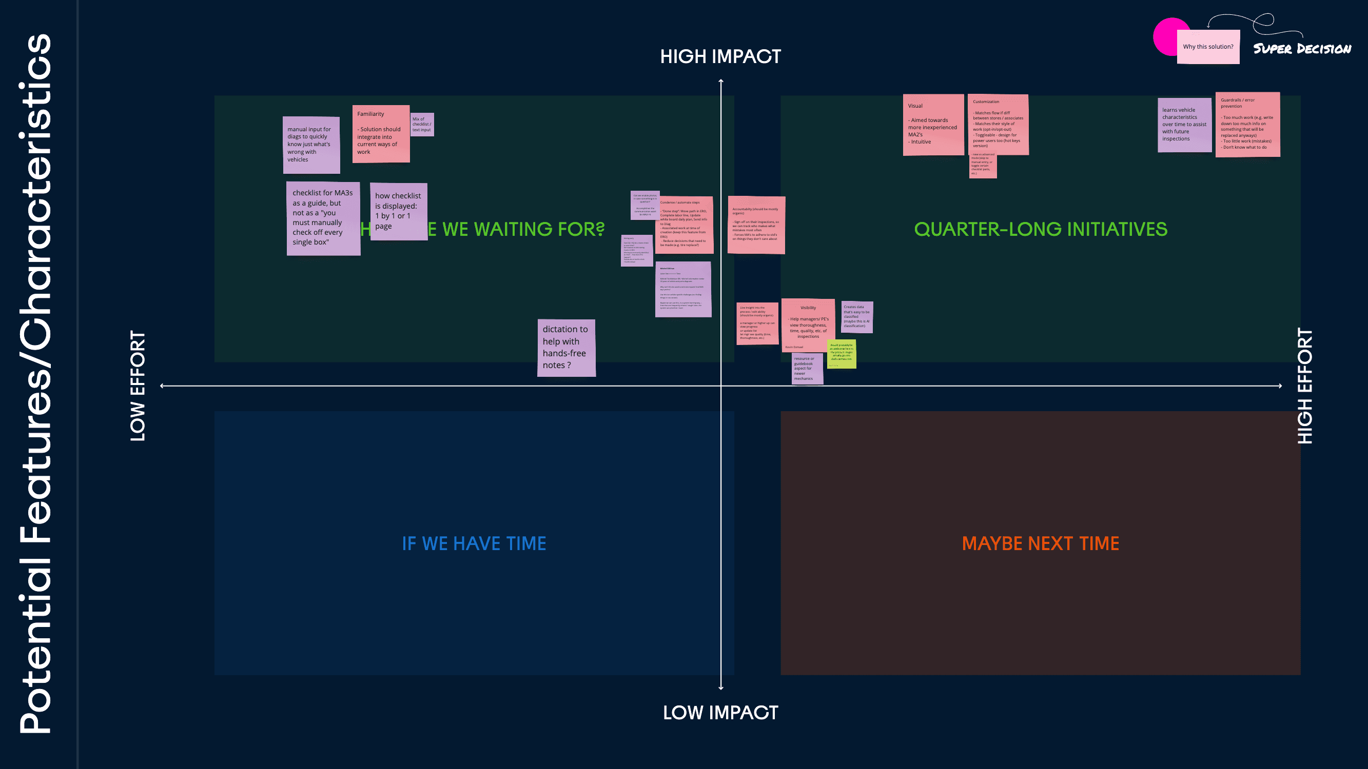
The easiest way I've always learned to decide on design goals is to compare effort with impact.
We mapped out various possible solution features and characteristics on this matrix.
Experiment Design
Phase 1: Understand user behaviors towards checklists
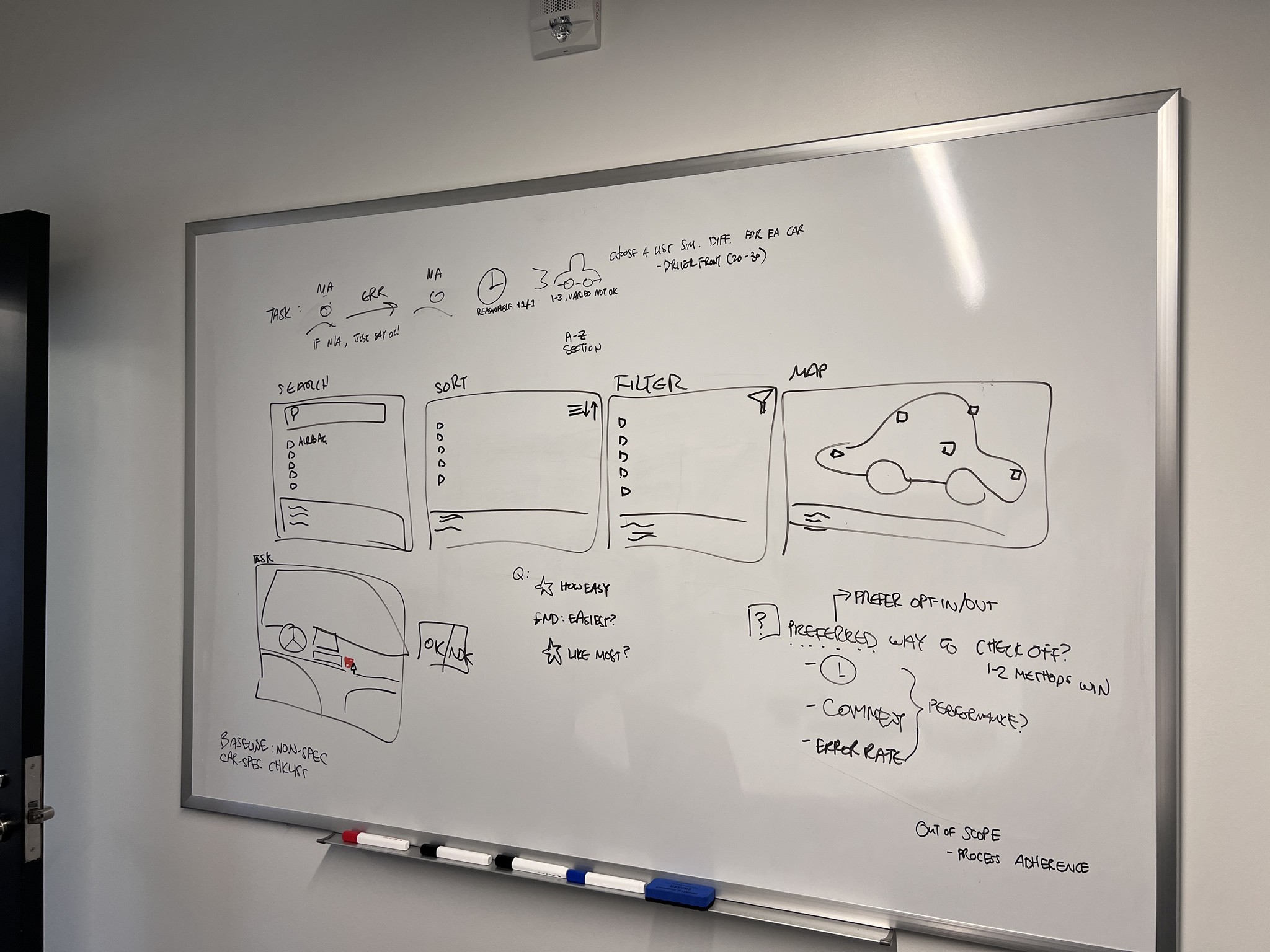
To de-risk key assumptions and test our hypotheses, we aimed to collect lightweight findings and directional data to begin a more informed digitization process. Our findings focused on interactions like searching, checking things off, chunking, referencing, and confirming things.
We wanted to understand user mental models for different checklist interactions.
Experiment Conditions and Limitations
Platform
UserTesting/UserZoom, 127 participants, with 15-25 participants per test condition on a mobile device
Recruitment
We used a low-cost, easy/quick-access demographic as a proxy for car mechanics: (Interested in cars, male, blue-collar, working age, etc.)
Imporant Differences to Note
CarMax MAs have more experieince
Our Usertesting participants simulate below entry-level functional expertise of a typical CarMax MA
They also don't have existing procedural preferences, as they're new users to this system.
Scenarios won't accurately replicate real-life
Paying our participants will make them more deliberate and patient

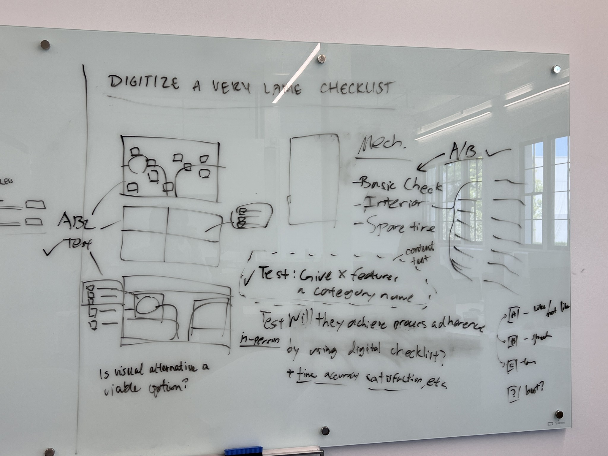
I started planning what to learn and test with the objective: "Digitize a very large checklist"
Experiment 1: View Type Preference, Usability, & Performance
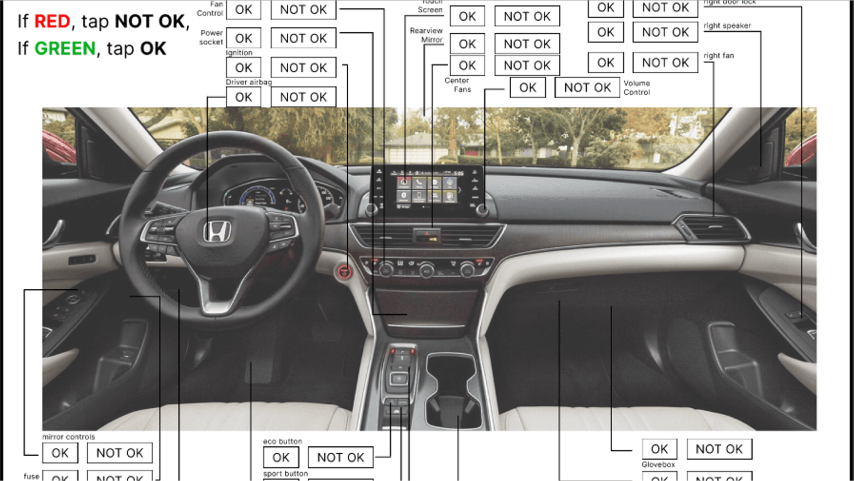
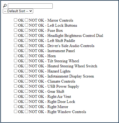
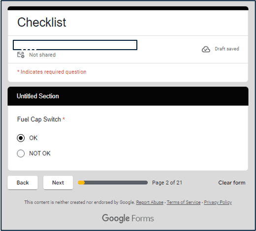
We quickly built out 3 different, functioning checklist prototypes to see what checklist structures would be most usable and likable.
We tasked participants with using each checklist to communicate defects in a car diagram to another person.
We found a strong preference for a more visual view, with no distinct time advantages of one over another.
Show Key Quotes
Show Key Learnings
Experiment 2: Item-Specific View Type Preference
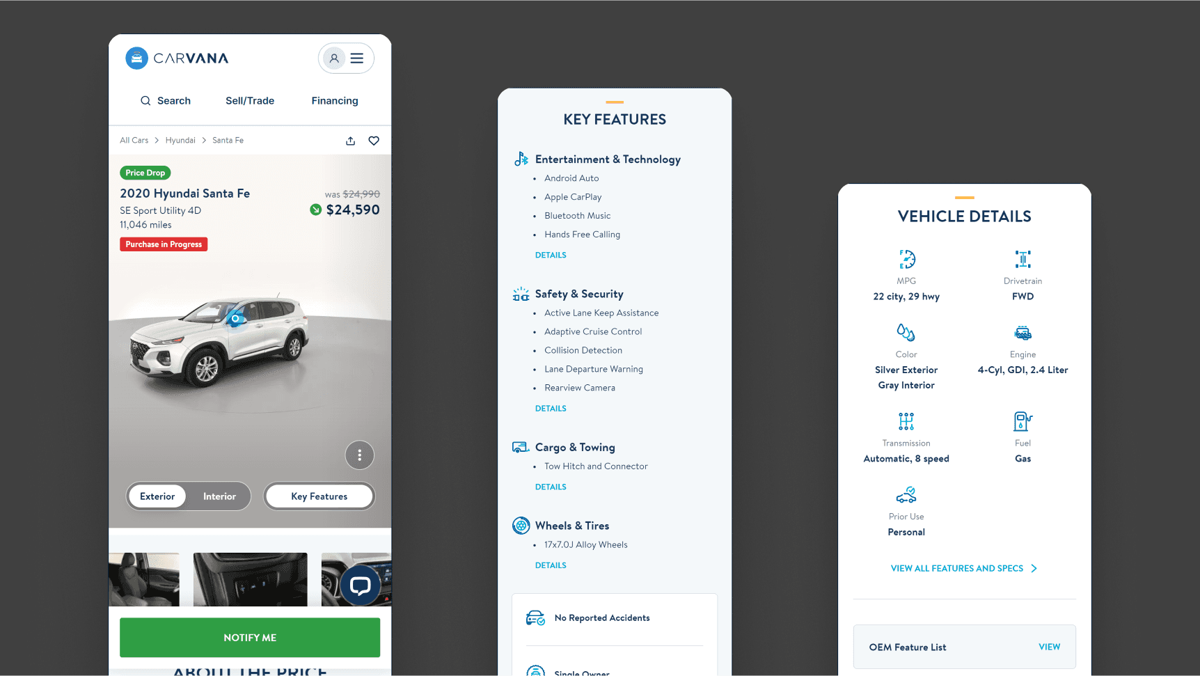
We asked participants to navigate Carvana's car pages to see what search structure users prefer for locating individual items, whether it be a 360 camera view, list, photo, etc.
We found a clear preference for using photos to locate specific items.
Show Key Quotes
Show Key Learnings
Experiment 3: Visual Mapping Sections and Regions
With a clear preference for more visual-based searching, I also wanted to know what sectioning made interaction and information processing easiest.
I quickly put together 3 differently-clustered diagrams with slightly varying 'check' interactions to observe.
We found an equally-split preference for the first and third visual search form.
Show Key Quotes
Show Key Learnings


Experiment 4: View-Type-Agnostic Informational Sub-Sections
Given a mobile display size, we wanted to know what informational sub-categories I might create for faster and more intuitive navigation.
For this task, I had our participants perform an open card sort to create categories that made sense to them.
We found no clearly emergent categories, with common sense around categories to be extremely varied for users.
Show Key Quotes
Show Key Learnings

Experiment Design and Iterations
Phase 2: Early MVP Usability Testing
To de-risk key assumptions and test our hypotheses, we aimed to collect lightweight findings and directional data to begin a more informed digitization process.
Next, we tested usability of various solution features, both at a feature-level and procedural-level, and then made tweaks to cues that created incorrect mental models.
Demographics & Limitations
Setup
In-Person, done in the office with 5-10 participants on a mobile device and real car.
Recruitment
We had various participants from the office test the prototype, some with no car experience whatsoever, and some being process engineers, developers, or people from completely unrelated fields.
Imporant Differences to Note
CarMax MAs have more experieince
Participants have below the functional expertise of an MA2/MA3
They also don't have existing procedural preferences.
Observation effect disallows shortcuts
Our observation makes users more meticulous and intentional, and less likely to take shortcuts as a typical MA would.
Experiment: Complete an inspection cycle
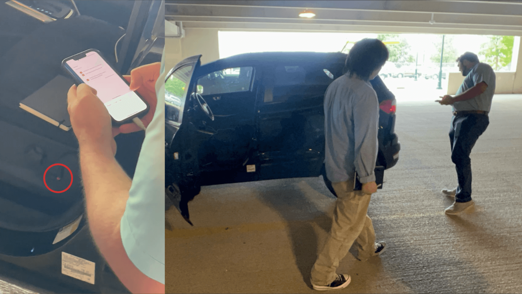
To simulate a real inspection, I used my own car and marked a couple of items with small red stickers to indicate a problem, then asked participants to look for them as they performed their inspections.
Show Key Quotes
Show Key Learnings
Car Section Checklists
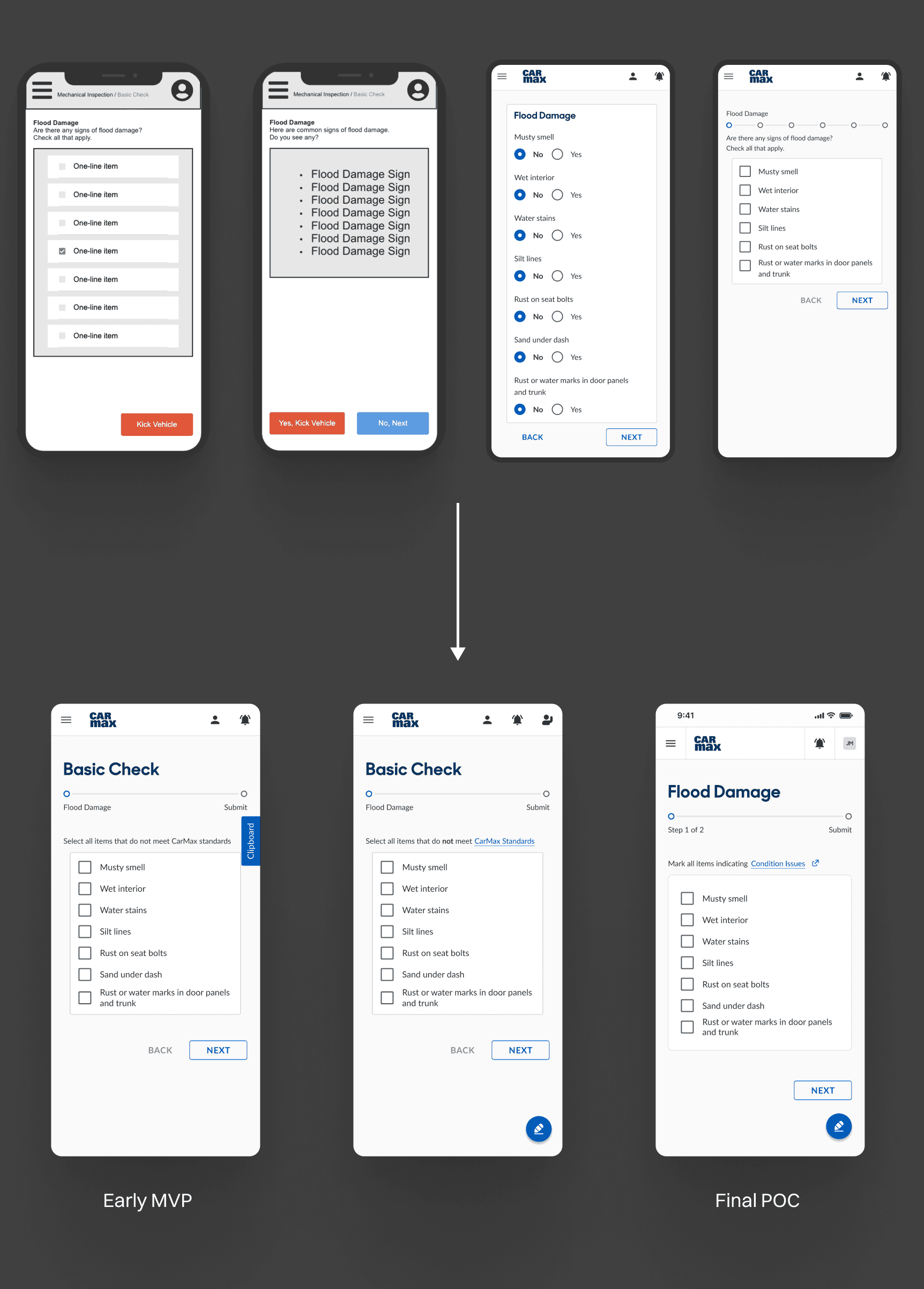
Despite having over 100 items, users found every checklist screen to be digestible, where even 'non-car-people' didn't feel a need for a search/sort/filter function, which we initially considered.
However, users often missed that they weren't supposed to check every single box.
Different factors like the instructions, no/yes, or standard boxes could dramatically change how it's used.
Before landing on the optimal checklist to test, I collaborated with UX writers to understand how differently the checklists might be interpreted. They also needed to be compact and scannable.
Instruction Copy Iterations
"Are there any signs of flood damage? Check all that apply."
This can't be consistently used for every section, as the flood damage section is uniquely used to see if a vehicle should be immediately 'kicked' from the inspection.
"Select all items that do not meet CarMax standards."
The 'not' was not always seen, bolded or not. It also tripped people up, similar to how it would on a typical school exam.
"Mark all items indicating Condition Issues"
This makes the instruction affirmative as the wording is framed to align with the 'check' symbol. We want MAs to know that what they check is bad, and not good.
Checkboxes
Even with just changing the instruction copy, there is a mismatch with what the checkboxes are telling users.
You'd think that a checkbox is just a square with a check in it. Wrong. Given the unique context in which its used, there are some important considerations.
Checkbox iterations
"Mark all…" + Red Box
Red had a much stronger signal that something was bad, but this made it even more contradictory with the Check.
Considering different icons
Although I considered using alternatives to the Check at first (like a 'thumbs down'), it would be best to avoid deviating from our design system.
"Mark all…" + Blue Box
The final solution makes the copy, check symbol, and box color all match an 'affirmative yes', meaning that — "Yes, this indicates a Condition Issue."
In-progress manual entry comments
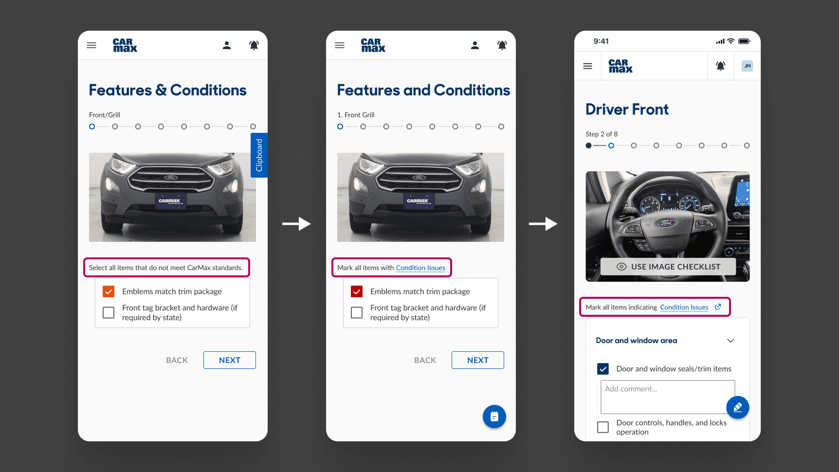
Just having an item checked is often not enough to communicate specific issues to Diagnostics. So to add comments as they would with a paper checklist, I wrestled with how easily it should be accessed, as I knew that if I made it too easy, users would still just end up skipping to the comments again.
My initial solution was to use a separate 'clipboard' sheet that hid the comments, but users couldn't find the clipboard easily.
Adding Comments
'Clipboard' Side Tab
To make sure this wouldn't conflict with the 'Next' button at the very bottom right of a screen, I thought it would be best to place this here, but most people couldn't find it, or understood what it would do.
'Notepad' FAB
This icon communicated the action a little better, but it still wasn't exactly clear.
Comment Dropdown Field
Now, the field shows up as long as an item is checked, getting rid of any need for navigating somewhere else. The FAB showed all comments, including ones from previous steps.

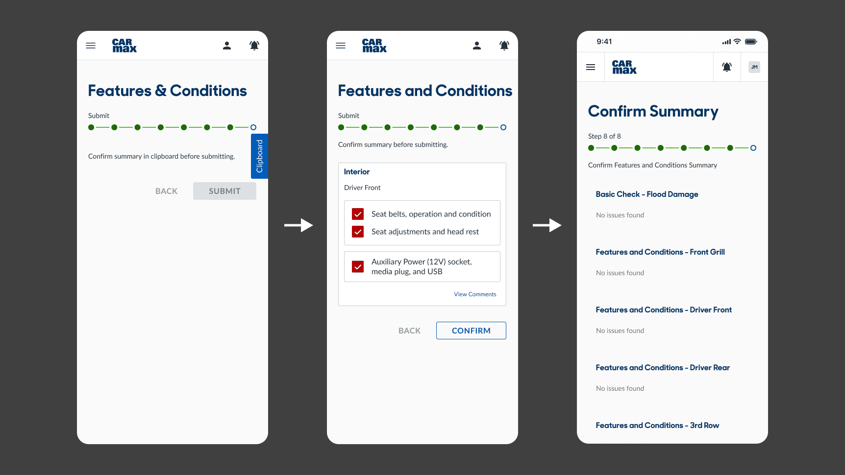
Summary Confirmation
To signal to the user that they completed a section, I designed a confirmation screen, which also aimed to increase accountability, which would in turn make our process engineers more comfortable with the 'only check what's wrong' checklist.
Confirm Summary
'Clipboard' Side Tab
We found that by disabling the 'submit' button until users checked the clipboard didn't really help that much, as they could simply close it right after.
Tile Component
Using this component to match the rest of the checklist made it confusing that this was actually a summary page. This iteration also used an 'edit/view comments' button per car region.
Full List
Showing a summary of every sub-section, even when there was nothing wrong allowed users to confirm them. Additionally, this got rid of having to click into another tab or sheet to view comments.
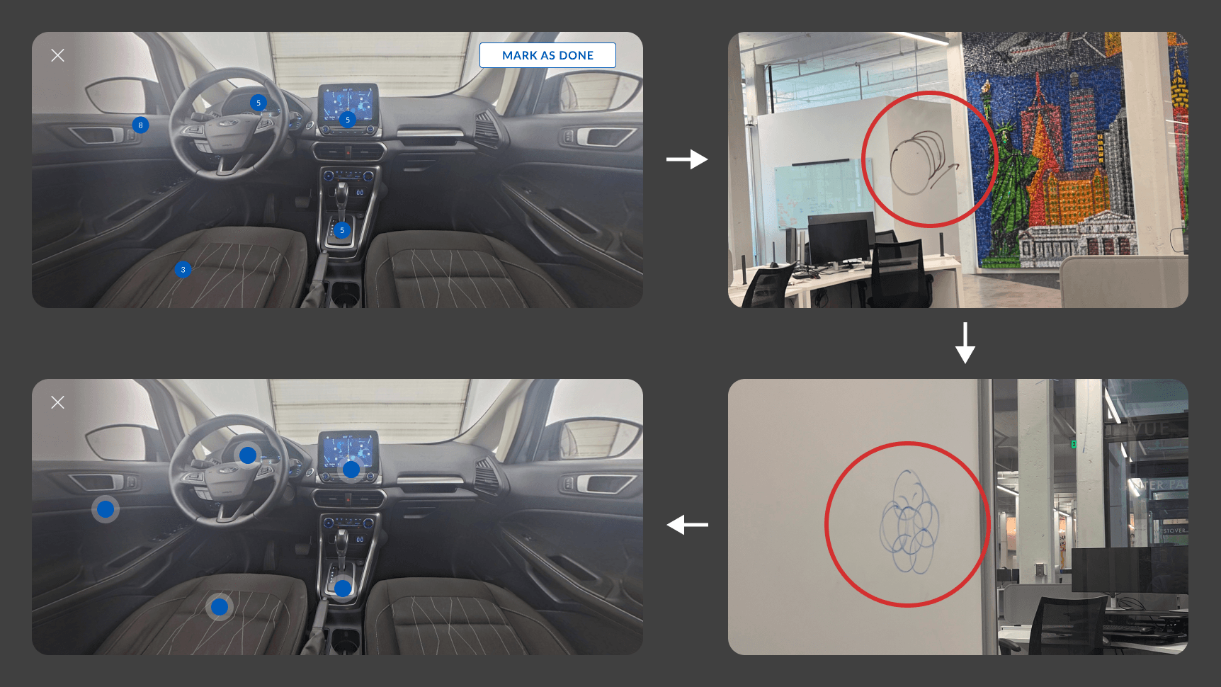
Visual Map Checklists
Having a visual checklist option was imperative to target more entry-level mechanics, as well as for more lengthy sections that might take too long to skim for an item. I designed different iterations that helped users understand what this actually was.
Adding Comments
Informative hot spots
After testing, most users didn't initially understand what the numbers on each of them meant (they were the number of items under each hot spot 'area', as having hot spots per item would make it too crowded.) So, we brainstormed different ways to communicate the same information using stacked and clustered hot spots.
Simple hot spots
I ultimately decided that the main task the user needs to accomplish here is find which hot spot an item belongs in. And so the number of items in each is not the most relevant.
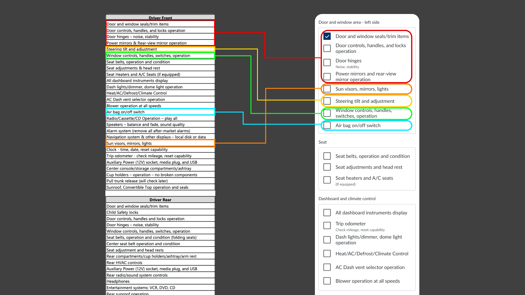
Content Organization
The sequence of items within the paper checklists were long-established. Although they generally follow a logical order, based on the mechanics we interviewed, a sequence which grouped items within similar regions would be more intuitive, as they check what they see in the car, not what they see on the paper.
Experiment Design
Phase 3: In-Store Proof of Concept Testing
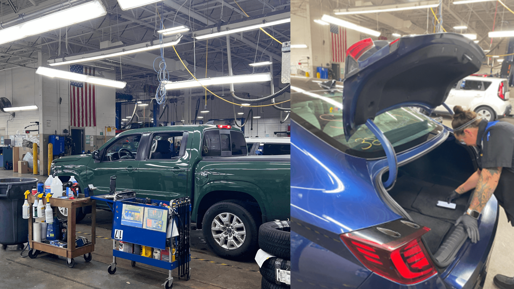
We wouldn't know if a product worked until we actually put it in front of real users in real scenarios. The goal of this test was to see if it could really replace a paper checklist in an inspection bay, when mechanics are on a tight schedule to do their jobs.
Finally, it was time to test our proof-of-concept prototype with mechanics while they do their job.
Experiment Conditions and Limitations
Participants
We tested with 3 MA3s, the typical role/level to complete these inspections, and also did walkthroughs with MA5s/Diagnostics, and other stakeholders in-store to collect general thoughts on the app prototype.
Tasks
We had each MA complete 3-5 inspection cycles using only the prototype, without any instructions. One of us filled out the original paper checklist simultaneously so they could still do their jobs normally.
Experiment: Complete mutliple real inspection cycles
In the reconditioning center, every mechanic who used the prototype was able to successfully achieve their tasks, and explicitly displayed their satisfaction and enthusiasm for this prototype, as it made their lives easier.
What's Next?
After the prototype proved viability, desirability, and usability, Service Ops will work out feasibility in regards to device types, integration with CarMax's repair order software, and other stakeholder interfaces.
In addition, Service Ops will also start thinking about the future state of this; we explored concepts like speech-to-text dictation, performance tracking, approved process customization, and photo condition capture, but left it out of scope for these few weeks.
What I Learned
During this half of my internship, I got extensive reps in the product cycle, and was able to learn from mentors and other design professionals, who all helped me push this product outcome to success.
Reflections
Iterate, iterate, iterate.
The biggest challenge of this project was the short timeline. This meant I needed to iterate as early and often as possible, which meant iterating as soon as we started our first tests. Even if artifacts were extremely low-fidelity, so long as it extracted a learning, that was all that mattered.
It's not just about the end-users.
In a project like this, it's easy to solely focus on the primary user. But this project was a perfect example of a constant tug-of-war between balancing different stakeholder needs. What was most fulfilling to me was being able to solve multiple problems for multiple groups with conflicting interests.
Leveraging different strengths
I was part of a 2-person team with the product manager intern, Lily, which meant we needed to work together very efficiently. Without an engineer, we built out the bare minimum we needed for testing using the help of AI, and I prototyped the rest. I leveraged my strengths in discovery and design, while Lily focused on higher-level coordination and product thinking with stakeholders.
✦
✦
Contact Me
Currently based in Atlanta, GA
but I love moving around.
You made it this far, so we might as well talk.
I promise it's worth it.
Designed and built by Kevin Esmael Liu, 2024 | No rights reserved—steal whatever you want bc I'll just come up with something better.
